
Page 21 - Masazi Solutions
P. 21
Communicating Data for Impact
Charts to use in Data Visualization
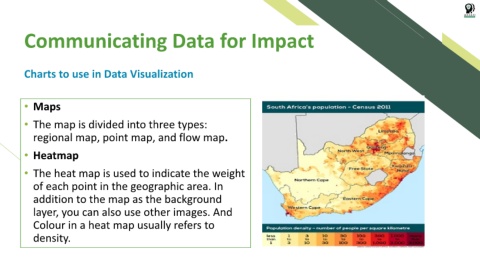
• Maps
• The map is divided into three types:
regional map, point map, and flow map.
• Heatmap
• The heat map is used to indicate the weight
of each point in the geographic area. In
addition to the map as the background
layer, you can also use other images. And
Colour in a heat map usually refers to
density.