
Page 26 - Masazi Solutions
P. 26
Communicating Data for Impact
Visualization Best Practices – Colour Pellet
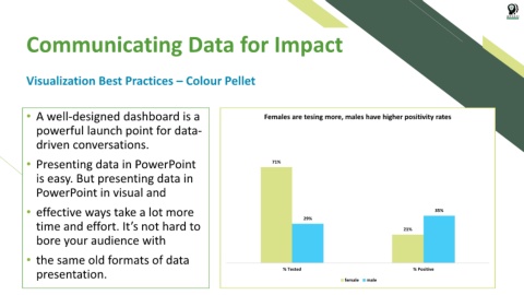
• A well-designed dashboard is a Females are tesing more, males have higher positivity rates
Testing & Positivity by Gender
powerful launch point for data- 100%
driven conversations. 90%
80%
• Presenting data in PowerPoint 70% 71%
is easy. But presenting data in 60%
PowerPoint in visual and 50%
• effective ways take a lot more 40% 35%
time and effort. It’s not hard to 30% 29% 21%
bore your audience with 20%
10%
• the same old formats of data 0%
presentation. % Tested % Positive
% Positive
% Tested
malemale
e
femalemale
f