Page 14 - Masazi Solutions
P. 14

Communicating Data for Impact


           Charts to use in Data Visualization


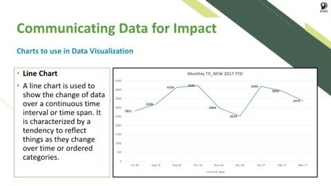
           • Line Chart                                                                                       Monthly TX_NEW 2017 YTD


           • A line chart is used to                                4500                          4134        4235                                 4192

              show the change of data                               4000                                                                                       3929


              over a continuous time                                3500              3196                                                                                 3373

              interval or time span. It                             3000  2811                                            2994

              is characterized by a                                 2500                                                              2514

              tendency to reflect                                   2000

              things as they change                                 1500


              over time or ordered                                  1000

              categories.                                            500

                                                                       0
                                                                             Jul-16      Aug-16      Sep-16      Oct-16      Nov-16       Dec-16      Jan-17      Feb-17      Mar-17

                                                                                                                             TX_New
   9   10   11   12   13   14   15   16   17   18   19